One of the questions I get most often is how I choose quilting designs. This customer quilt from a few months ago offers a great peek at how I come up with complicated-looking quilting designs that are not that hard to execute, but really make an impact in the negative space.

This quilt (pattern is Ruby Roads by Meadow Mist Designs) is very different from the ones I usually work on, but I was SO STOKED to take it on when Heidi asked if I could quilt it for her, because I saw the potential in all that negative space!

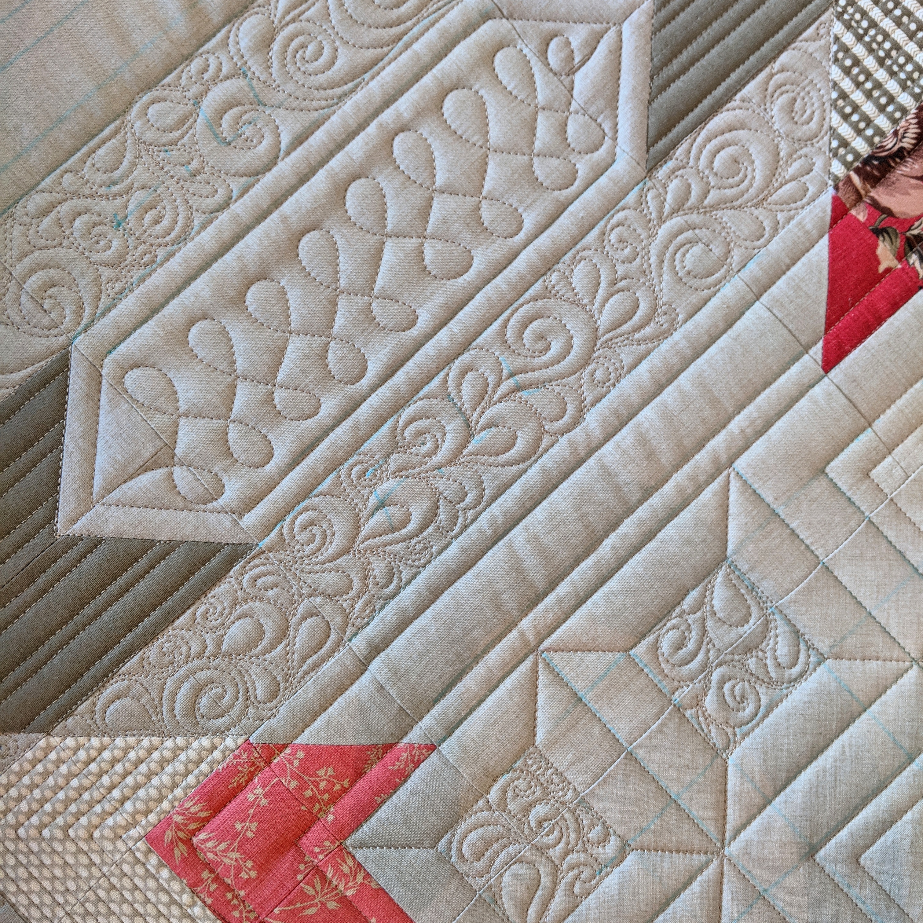
My design started with a rough sketch of the overall layout to get a sense of space. I knew I would put all the interesting quilting into the negative space (the area between blocks) rather than in the print fabrics, since any fancy quilting would be lost there. I essentially assumed the print area would stay unquilted and puff up in contrast with the quilting on the background.

Create guidelines for the negative space
In this first rough sketch, I’m trying out different ways to put structure into the negative space, extending the lines of the blocks. I tried squares, on point squares, and long strips overlapped and echoed in different combinations, until I found something that felt interesting and balanced. These will be my guidelines for the next step.

In my next sketch, I zoom in on the area between one set of blocks. I drew the outlines of the patches in ink so they wouldn’t be erased as I played around in pencil. I drew the guidelines in blue pencil crayon. This is usually what I mark on the quilt top before I start quilting, to help me keep everything lined up, even when I can’t see more than a part of a block.

Now comes the fun part! Using the guidelines, I draw straight lines to define the spaces, leaving bigger gaps where I want unquilted areas to stand out, and echoing the lines to add definition, like a picture frame. I put denser fill areas beside the unquilted areas to provide contrast: smushed down areas make the picture frame areas POP by comparison. This is just scribbles in the sketch, because I don’t need to pick a specific fill motif at this point. I just know it will be somewhat dense.

Break up the negative space
Next, I look at the area inside the picture frame. I can fill this all with one motif, or I can break it down into smaller chunks. Here, I put 9 smaller frames inside the big frame to add more interest, then used the same fill inside each smaller frame.

The space that’s left in between the frames was next. I knew I was getting a bit elaborate already, so I did straight lines connecting the blocks, added an echo to separate from the dense fill, and went with a quick wishbone motif to get me from one end to the other.

The fun layout of this quilt has half-blocks on the edges, and large setting triangles on the corners. I wanted to give a bit of a border in these areas, so I repeated the spacing of the diagonal echoed lines from the frame around the corners, and inside the smaller frames that went over the edge.

Last, I added some simple lines in the blocks themselves, with dense fill in the little bits of background fabric.

What do you think? You can totally do that, right? At least on paper? If there’s a quilt you’re going to be quilting in the near future that features lots of negative space, why not try sketching out some frames to explore how you might quilt it? I’d love to see what you come up with!


Thank you for walking us through your process. It’s really interesting and helpful to see it all.
The designs are really beautiful. I love all of your designs
Absolutely beautiful
A beautiful quilt and stunning quilting
Hello. New to quilting. So forgive my ignorance, but how do you translate the drawing to the material? Is it freehanded, or basically traced (as in, drawn then laid on top of material as you trace the design, and removed paper afterwards)?
Hi Harley! The sketches are on small notebook paper, so they’re just for planning purposes. Once I have a plan, I use the patchwork lines as my guide as much as possible, and add any additional guidelines onto the fabric using rulers and water soluble pen. The quilting stitches are all hand guided, using rulers for straight lines where needed. Stay tuned for more Free Motion Quilting and Ruler Quilting content coming soon!
I’m sorry if you mentioned it already, but what batting did you use for this quilt?
We used Hobbs Tuscany 100% wool. It gives great loft and really helps the quilting pop!